You pull every book off the shelf, stack them on the floor, step back, and immediately regret it. The shelf looks emptier and sadder than before. So you start putting things back, one object at a time, and forty minutes later you're standing in the same spot, holding a ceramic bowl, wondering why nothing looks right.
I know that scene because I lived it for the better part of a decade. I styled shelves for clients across a mix of apartments, kitchens, and one very stubborn built-in that fought me for two weeks. What finally cracked it for me wasn't taste or talent. It was a system: figure out your anchor pieces, group them in odd numbers, and let the empty space do half the work.
Below is the process I actually use, including the numbered rules professionals keep borrowing from each other, and the mistakes that make a shelf look like a clearance aisle.
Key Takeaways
- The 3-5-7 rule means grouping objects in counts of three, five, or seven for visual weight that feels intentional, not staged.
- Start with the largest objects and work down to small accents. Most people do the reverse and end up with a cramped shelf.
- Negative space is a design element, not wasted room. A shelf should be roughly 30-40% empty.
- Limit your palette to two or three dominant colors, plus one accent.
- Vertical and horizontal layering (book stacks with objects on top) creates depth that flat rows never will.
- Fewer, bigger pieces beat many small ones every single time.
How to style shelves like a professional decorator
The honest answer is less romantic than the photos suggest. Professionals don't have better objects. They have a better sequence.
Here's the order I use, and I'll defend it to the end: anchor first, books second, accents third, then subtract.
Step one: place your largest objects
Pick your three biggest pieces: a large vase, a framed print, a lamp, a sculpture, a basket. Place one per shelf zone, not all clustered on one level. These are your anchors, and everything else orbits them.
I made the classic mistake early on of buying small decorative objects first. Little brass animals, tiny candles, a ceramic mushroom phase I'd rather not discuss. The result was a shelf that read as clutter because nothing had visual weight. Big objects create structure. Small objects create noise until they're supporting something bigger.
Step two: arrange books with intention
Books are the most forgiving styling tool you own, and most people use them wrong.
Three working methods:
- Standing rows for density and color blocking
- Flat stacks of two to four to create a pedestal for a small object
- A mix of both on the same shelf, which is what I do in almost every install
If you have a wall of books and no room for objects, you're not stuck. Group by color family, leave one shelf partially bare, and lay a horizontal stack in the gap. That single move breaks the "library wall" monotony without removing a single title.
Step three: add accents last
Now the small things. A candle, a small frame, a stone, a dried stem in a narrow vase. Add them one at a time and step back after each. I can't tell you how many shelves I've rescued just by removing the fourth accent from a group of three.
Which brings us to the numbers.
What is the 3-5-7 rule in decorating?
The 3-5-7 rule is a styling guideline that says objects look best grouped in odd numbers—typically three, five, or seven—because odd counts create a focal point that the eye can't split into symmetrical pairs. A group of three reads as one cluster. A group of four reads as two competing pairs, and the brain keeps trying to balance them.
In practice, I use it as a rough target, not a law. A shelf with one large vase and two small objects: that's a three. A fireplace mantel with five pieces of varying heights: five. A long console with seven objects across its length: seven.
Why odd numbers work
Even numbers invite the eye to find the middle and draw an invisible line of symmetry. Odd numbers don't offer that line, so the eye wanders across the arrangement instead. That wandering is what makes a display feel alive rather than static.
Try it right now. Take four objects off a shelf and put three back. The difference is immediate and slightly unsettling the first time you notice it.
What is the rule of three for shelves?
The rule of three is the practical version of 3-5-7 and the one I lean on daily. It says that any grouping of decorative objects should contain three elements of different heights or shapes, so the arrangement forms a triangle rather than a flat line.
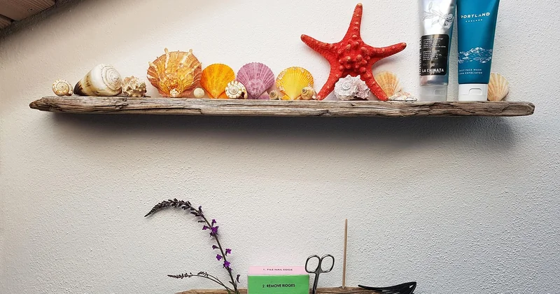
Picture a tall candlestick, a medium vase, and a low stack of books. The eye travels up and down across them, which is exactly what you want. Three objects of the same height, no matter how beautiful, will always look like a display in a store window rather than a home.
I apply the rule of three at two scales. First within a single cluster on one shelf. Then across the whole unit: three shelf "zones" with visual weight, separated by breathing room.
How to make a shelf look fancy?
Fancy is almost never about expensive objects. It's about restraint and contrast. I've styled a shelf with a $4 thrift store bowl next to a client's family photograph, and guests assumed the whole arrangement was custom.
The tell of an amateur shelf is too many things at the same height, texture, and tone. The tell of a professional shelf is controlled variety: one matte object, one glossy, one natural texture, one metallic accent. That mix is what reads as "designed."
The four-texture mix
Aim for these four surfaces across your arrangement: something organic (wood, dried stems, stone), something soft (linen, a folded throw), something reflective (glass, brass, ceramic glaze), and something matte (unglazed pottery, a matte frame).
You don't need four objects. One object can carry two textures. But if your entire shelf is glossy ceramic, it will look flat no matter how much you paid for it.
How can I arrange my shelves in a stylish way?
Style comes from rhythm. If every shelf follows the same formula, the unit feels machine-made. If each shelf has a different logic, it feels curated.
Here's the loose pattern I use across a five-shelf unit:
- Shelf one: a single large anchor, nothing else
- Shelf two: a full row of standing books, one small object at the end
- Shelf three: mostly empty, with a flat stack and one tall accent
- Shelf four: a mix of vertical books and horizontal stacks with objects on top
- Shelf five: a dense cluster of small objects, no books at all
Notice that shelf three does almost nothing, and that's the point. The emptiness gives the eye somewhere to rest. I aim for roughly a third of the total shelf space to stay visibly open.
| Arrangement approach | Best for | Watch out for |
|---|---|---|
| Single anchor per shelf | Open shelving, kitchen, minimal interiors | Can feel cold without one soft texture |
| Full book rows | Reading rooms, studies, dense libraries | Reads heavy, needs a bare shelf to break it |
| Mixed stacks and standing books | Living rooms, built-ins | Requires discipline—easy to over-fill |
| Object-only display | Bookshelves without books, kitchen shelves | Needs larger pieces or it looks scattered |
Common mistakes that flatten a shelf
The biggest one isn't clutter. It's symmetry.
Two identical vases flanking a central object is the fastest way to make a shelf look like a hotel lobby. The second mistake is filling every gap. I spent a year fighting a client who wanted every square inch occupied, and every time we added "just one more piece," the shelf got worse. We ended up removing nine objects and the room instantly felt larger.
Third mistake: ignoring the shelf above. Whatever you place on a lower shelf will cast visual weight upward. If your bottom shelf is heavy and your top shelf is empty, the whole unit leans. Balance the load vertically, not just horizontally.
What if I don't have enough objects?
Use books, baskets, and a single plant. Three objects per shelf is plenty. A shelf with one beautiful thing and empty space around it will always beat a shelf crammed with mediocre pieces.
Should I match my shelf styling to the room's color scheme?
Not match—relate. Pick two colors that echo the room and let everything else stay neutral. Full coordination looks staged; a slight mismatch looks lived-in.
The thing nobody tells you
A shelf is never finished. The ones in my own home change every few months, usually because a book gets pulled down and never returns, or because a bowl finally gives up on holding anything. The best-styled shelves I've ever seen looked that way because someone kept editing them slowly, over years, without ever declaring them done.
So don't aim for the final arrangement. Aim for one that's good enough to live with and easy enough to change when a new object shows up. That's the actual professional method: not a perfect shelf, just a shelf that keeps earning its spot.