You're standing in a 42-square-metre apartment, holding a sofa you just bought, and it fits through the door but refuses to fit the room. The landlord won't let you knock down the wall. You can't move the radiator. And somehow, the previous tenant made this exact space look open, airy, and calm.
Most advice on modern interior design ideas for small apartments tells you to "declutter" and "use light colours." Helpful. Truly. But that advice is the same in 2014 as it is in 2026, which tells you it isn't actually about small spaces at all. It's about small thinking.
Modern design in a compact apartment is not a style problem. It's a geometry problem. And once I started treating it like one, my results changed completely.
Key Takeaways
- Modern means a specific visual language — clean planes, integrated storage, controlled materials — not just "new furniture."
- Floor area matters less than sightlines and circulation paths. A 38 m² flat can feel larger than a badly planned 55 m² one.
- The highest-return upgrades are usually lighting and storage, not paint.
- Legs, gaps, and negative space do more for perceived size than mirrors do.
- Most small-apartment mistakes are irreversible without breaking your deposit.
Modern interior design ideas for small apartments: what "modern" actually changes
Here's the thing nobody puts in a listicle: "modern" is a set of rules, and those rules happen to work unusually well in tight rooms. Scandinavian design asks you to add warmth and texture — hard in 40 m². Bohemian asks you to layer — dangerous when you have nowhere to put layers. Rustic asks for heavy materials that eat visual space.
Modern asks you to do the opposite of all three: reduce the number of visual events.
The four rules of modern compact design
I've renovated two apartments under 45 m². The second one went far better than the first, and the difference came down to four principles I now apply without exception:
- Fewer materials, repeated. Two or three finishes across the whole flat. One wood tone, one matte neutral, one metal accent. When the eye stops counting, the room stops feeling small.
- Storage disappears into the architecture. If you can see where things are stored, the storage is eating your room.
- Light comes from where you don't notice it. Recessed, indirect, layered.
- Objects get negative space around them. A shelf with four things on it reads as design. The same shelf full reads as clutter.
The catch? Rule two is expensive up front and cheap over fifteen years. Most people do it backwards.
Where most people waste money
A mistake I made early on was spending my entire renovation budget in the living room. New paint, new floor, a statement lamp I loved. Then I ran out of money for the hallway and the kitchen, and the flat felt cheap in exactly the places a guest walks through first.
If I had to split a modest budget again, it would look roughly like this: 40% integrated storage, 25% lighting, 20% flooring and paint, 15% furniture and objects. That order feels boring. It produces rooms that look expensive.
Layout before decor: the part everyone skips
The single most common design failure in small apartments is solving the wrong problem. People buy smaller furniture to gain space. What they actually needed was to move the furniture.
Start with circulation, not with a moodboard
Take a floor plan — even a rough one drawn on paper — and mark the paths you actually walk: door to kitchen, kitchen to sofa, bed to bathroom. Those paths need roughly 60 to 70 centimetres of clear width to feel comfortable. Anything under that and you'll start unconsciously avoiding the route.
Once the paths are drawn, whatever floor area is left is where furniture can go. In my last flat, this exercise eliminated a console table I'd been planning for three weeks and freed up an entire wall. I'll admit I was annoyed at how obvious it was in hindsight.
The sightline test
Stand at your front door and look straight in. Whatever the eye lands on first is what sets the impression of the whole apartment. If it lands on a radiator, a bin, or the back of a chair, the design isn't finished — regardless of what the rest of the room looks like.
Modern design handles this by making the first sightline deliberately empty: an open wall, a window, or a plain vertical plane. It reads as confidence. It costs nothing.
Storage that doesn't look like storage
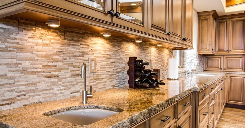
I once measured a client's flat and found roughly nine square metres occupied by freestanding furniture: a wardrobe, a bookcase, a sideboard, and a TV unit. Nine square metres in a 40 m² flat. That is nearly a quarter of the home occupied by containers.
Built-in versus freestanding: the honest comparison
| Approach | Upfront cost | Space efficiency | Reversible? | Best for |
|---|---|---|---|---|
| Freestanding wardrobe | Low | Poor — gaps, dust traps, wasted height | Yes, easily | Renters moving within a year |
| IKEA-style modular system | Medium | Decent if fitted to ceiling | Yes, with some effort | Most apartments |
| Custom joinery, floor to ceiling | High | Best — no gaps, no visual noise | No | Owners staying 5+ years |
| Raised platform with under-storage | Medium-high | Excellent in low rooms | No | Studios under 30 m² |
| Overhead and wall-hung units | Low | High, but visually heavy if overused | Yes | Kitchens and bathrooms |
Notice the pattern: cost and permanence track together. Renters get flexibility, owners get space. If you're renting, the modular row is where most of the value sits — but only if you take it all the way to the ceiling. Stopping 30 centimetres short creates a ledge that collects dust and makes the whole wall look shorter.
The vertical rule
Look at the top of your wardrobe. Whatever is up there, it's wasted. Extending storage upward is the cheapest square metre you will ever gain, because it already exists and you're not paying for it.
The trade-off is visual weight: a full-height block of cabinetry is a big dark mass in a small room. Modern design solves this by matching the front panel to the wall colour, or by using a shallow depth — 35 to 40 centimetres — so the mass recedes.
Lighting is the biggest return on investment in a small flat
One ceiling light in the middle of a room makes any apartment look like a corridor. It flattens the walls, kills depth, and removes shadow — and shadow is what tells your eye that space exists.
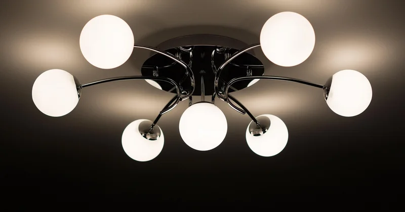
So what's the catch? Layered lighting costs more to install than a single pendant. In a rental, you can't always chase cables into the ceiling.
Three layers without touching the ceiling
Here is what I'd do in any apartment where drilling into the ceiling isn't an option:
- Ambient: keep the existing ceiling fixture but swap the bulb for something warm and dimmable — around 2700K rather than the harsh 4000K that ships with most rental fittings.
- Task: a wall-mounted reading light beside the bed or sofa. No floor space consumed.
- Accent: one plug-in uplight or a strip of LED behind a shelf, aimed at the wall rather than at the room.
That last one is doing more work than you'd expect. Bouncing light off a wall makes the wall read as further away, which is the closest thing to free extra space you will find. I put a two-metre LED strip behind a low shelf in a 38 m² living room and the difference was more noticeable than repainting the entire flat.
Does smart home tech help in a small apartment?
Yes, but not the way it's marketed. Voice control saves you nothing in a room where you can reach the switch. What actually helps is automation that solves a real constraint: motorised blinds for hard-to-reach windows, a smart thermostat that stops you heating an empty 40 m², or sockets on schedules so lamps turn on before you get home.
The technology that earns its place is the technology that removes a physical obstacle. Everything else is a gadget with an app.
Materials and colour: building a modern palette that survives small spaces
Here's where I'll take a firm position: the all-white apartment is dying, and good riddance. White walls in a small room with a single window produce a flat, cold, vaguely clinical result, and every scuff shows.
What works better is a narrow, warm, low-contrast palette — mid-tones that shift slightly between rooms. You get depth without chopping the space into visual boxes.
Contrast is a tool, not a default
High contrast draws boundaries. In a small apartment, every boundary you draw costs you perceived space. This is why strongly patterned floors, dark skirting against pale walls, and dark furniture on light floors all shrink a room.
Use contrast deliberately, in one place, where you want the eye to go. In my current flat that's a matte black tap in the kitchen. It's the only truly dark object in the room, and it makes the whole space feel planned rather than accidental.
Modern vs Scandinavian vs bohemian: which actually suits a small flat?
They're not interchangeable, and picking the wrong one for your floor area causes real problems.
| Style | Signature move | Behaviour in under 45 m² |
|---|---|---|
| Modern | Clean planes, integrated storage, few materials | Scales down well; can feel cold if lighting is flat |
| Scandinavian | Pale wood, textiles, soft light | Warm and forgiving; needs restraint or it clutters fast |
| Bohemian | Layering, plants, mixed patterns, travel objects | Hardest to control — every layer consumes sightline |
| Industrial | Raw materials, exposed services, dark metal | Visually heavy; needs high ceilings to breathe |
If you want warmth without the discipline of modern, take modern structure and add Scandinavian softness: identical layout, one textile, one plant, one warm wood. That's the combination I keep coming back to, and it's the one I'd defend against anything else.
Five mistakes that quietly ruin a small modern apartment
Knowing what not to do is worth more than any shopping list.
Furniture that's slightly too big. Not dramatically too big — slightly. A sofa five centimetres too deep makes a whole room feel tight, and you'll never identify why.
Matching sets. Buying the full living room set from one catalogue flattens the room. It's the fastest way to make a small space look like a showroom instead of a home.
Rugs that are too small. A rug floating in the middle of the floor draws a box around itself. A rug that reaches under the furniture edges expands the perceived area instead.
Mirrors placed badly. Mirrors are not magic. A mirror facing a blank wall reflects a blank wall. Aim them at a window or a lit surface, or skip them entirely.
Treating the hallway as an afterthought. In a small flat, the entrance is the first twelve seconds of the entire design. Give it a purpose: a hook, a bench, a light. Not a pile.
What if I can't drill into the walls?
Rental constraints are real, and I've worked around them plenty. Adhesive strips hold light shelves and LED strips fine. Full-height storage can run on tension poles without a single screw. Floor lamps and plug-in wall lights cover most of the lighting layer. And if you want one permanent-looking change, negotiate: many landlords will agree to a fitted wardrobe if it stays when you leave.
The constraint is annoying. It isn't fatal.
Where to actually start this weekend
Empty the room in your head. Walk the paths. Stand at the door and look at what the eye hits first. Move one thing. Then live in it for a week before you buy anything.
I've never once regretted waiting a week before a purchase. I have regretted every single sofa I bought in an afternoon.
The apartment that feels modern isn't the one with the newest furniture. It's the one where someone decided what the space was for, and everything else got out of the way.